
How to use CSS aspect ratio!
There are many, many different uses for CSS and many things you can do with it. Here's how to use aspect ratio!


There are many, many different uses for CSS and many things you can do with it. In my time building websites, I have met and overcome many difficulties using CSS including making responsive sites display images properly, and this is how I do it with a lesser-known CSS function!
What is aspect ratio?
Coming from a photography background, I was quite well-versed in terminology like this. To put it simply, the aspect ratio is the ratio of width:height of an element - most often an image.
For example, YouTube thumbnails use an aspect ratio of 16:9. For every 16px along the width of the thumbnail, there are 9 down the side. Or in this image, there’s a 4:3 aspect ratio…

How is it written in CSS?
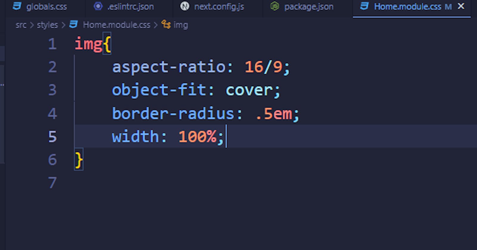
The CSS aspect ratio property is written simply like most other CSS properties. for instance, to give an image an aspect ratio of 16:9 you would simply write aspect-ratio: 16/9; however, this may squash the image like in ‘IMAGE ONE’ this JSFiddle.

How do we fix squashed images?
Using the object-fit CSS property we can change how the image fits the area given by the aspect-ratio
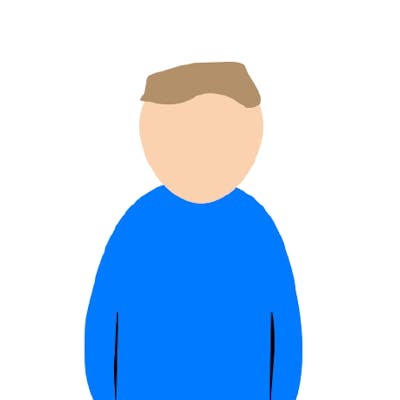
For example, we can use object-fit: cover; to make the image fill the area provided. this is demonstrated in ‘IMAGE TWO’ of our JS Fiddle

What if I still want the whole image to show?
While unlikely, some use-cases may need you to still have the full image shown, in this situation object-fit: scale-down; allows for the image to shrink to fit perfectly in the provided area by the aspect ratio. You can try this out in the JS Fiddle.

Are there other options?
Of course, there are other options, but these are just a few of them, want to see what else you can do with aspect-ratio or object-fit? MDN has some great documentation on both of these things!
aspect-ratio: https://developer.mozilla.org/en-US/docs/Web/CSS/aspect-ratio
object-fit: https://developer.mozilla.org/en-US/docs/Web/CSS/object-fit
aspect-ratio browser compatibility
Chrome 88+
Edge 88+
Firefox 89+
Opera 74+
Safari 15+
Chrome Android 88+
Opera Android 63+
Samsung Internet 15.0+
WebView Android 88+
object-fit browser compatibility
Chrome 32+
Edge 79+
Firefox 36+
Opera 19+
Safari 10+
Chrome Android 32+
Opera Android 19+
Samsung Internet 2.0+
WebView Android 4.4.3+